Recoloring Art on the Fly for Dyebreaker
This is an artist page by Walt Mitchell. Walt was a mentor during the Fantastic Arcade x CATS+ 2024 cohort.
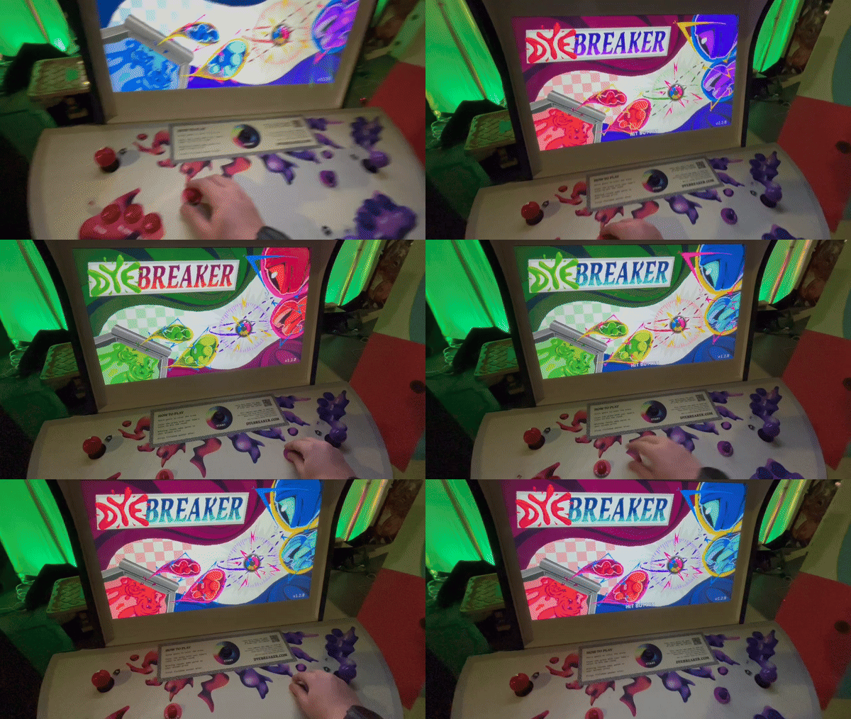
Early in the development of our arcade game, Dyebreaker, my friends and I hit a snag – how can we allow the player to choose both their color and their character without creating art for every possible combination?
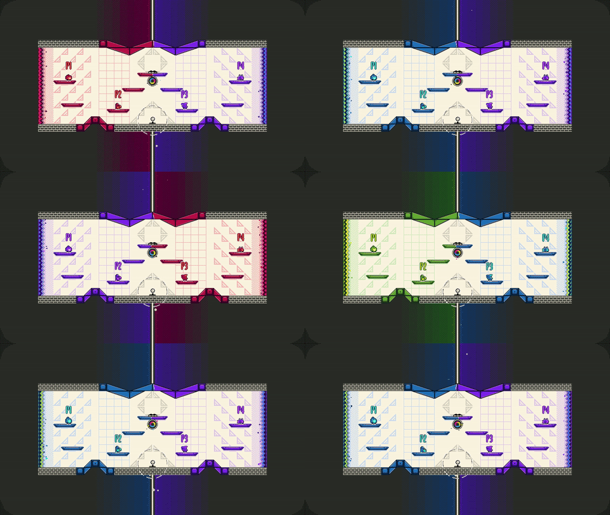
In other games, it might be reasonable to create sprite variations manually, but we planned to add many more characters (and colors) over time. Even worse, it wouldn’t just be characters that needed recoloring, it would be every piece of art in the game: the gameplay arenas, the illustrations, the menus, even the title screen. We wanted them all to adopt the colors of the two active teams.
Hand-crafting every combination was not realistic. So, how could we use code to recolor art on demand? And aside from the tech, how do we make art that looks great in any color?
What is Dyebreaker?
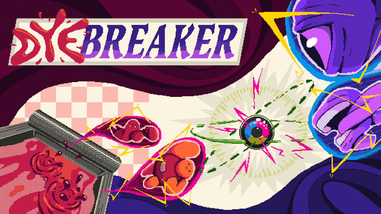
Dyebreaker is a 4-player “air hockey-like” video game about pushing pucks and making screen print posters. Scoring goals paints the arena in the color of your team, and you add layers of detail to your team's screen print poster for each stage you win. First finished poster wins!
The game was developed in Unity and designed primarily for the arcade – in 2024 we debuted the Dyebreaker arcade cabinet with Arcade Commons at MAGfest, and today the cabinet can be found at Wonderville, an indie arcade bar in Brooklyn, NY. Dyebreaker will be also released on Steam early this year.
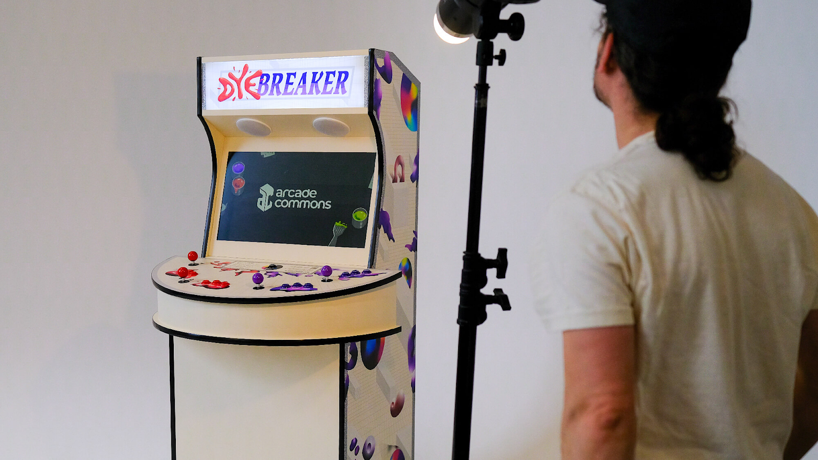
Dyebreaker is a collaboration between myself (Walt Mitchell, game design and code), Ramsey Haefner (character and UI design), Matt Fry (cabinet design and fabrication), and Devin Curry (music and sound).
Visual References and Creating the Color Palettes
Dyebreaker is a game inspired by poster art, so color plays a key role. We wanted players to be able to select any team color and have their characters, poster, and everything else look good in that color, regardless of their choice. So, we needed to find our palettes.
Each palette needed a full range of shades, from dark to light, because each could be used to color a variety of sprites. We needed a set of reasonably interchangeable palettes (every sprite should look good in every palette) that were also totally distinct (the two palettes should stand from one another when applied to opposing teams, minimizing confusion). More than that, the colors should look nice when paired together, somewhat complementary, or at least not clashing.
Interchangeable, distinct, and complementary – that’s a lot of requirements for a small set of colors. Where to begin? There are tools for exploring color schemes, like coolors.co, but our process relied heavily on references. The Game Boy Color was a huge inspiration because we planned to use pixel art, and we knew that each of our sprites would be limited to a single color palette plus shared neutral colors, limitations similar to the ones that existed on the GBC.
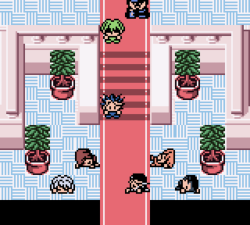
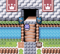
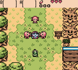
With a lot of references, a lot of mockups, and a lot of trial and error, we ended up with three vibrant color palettes for players to choose from – red, green, and purple, each with five values. We liked how these palettes looked distinct yet complementary in any team configuration. Five values per palette felt like the right amount of flexibility when shading our sprites; we’d rarely use all five values in a single sprite, but we needed a decent spectrum of dark and light for overall variety across the game.
We also included a handful of neutral colors not associated with either team. This neutral palette is not remapped at runtime. It includes black, white, and various shades of gray.
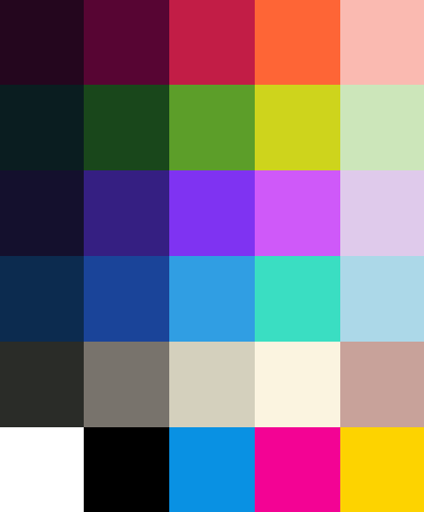
Lastly, we added cyan, magenta, and yellow. After all, we made a game about printing and so our dye-soaked pucks needed some CMY theming. (More recently, we added a blue team palette, and we’ll be adding other team colors soon.)
Our color scheme was probably the thing we agonized the most over, or at least the thing we came back to the most often. “Are we sure the green is working?”
Drawing the Pixel Art
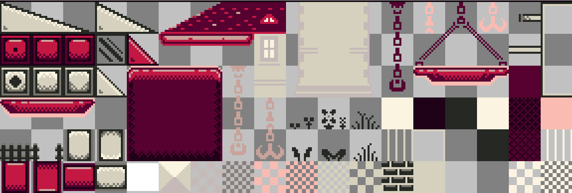

Now that we had our palettes, we could make our art. We used Aseprite, an excellent pixel art program. Knowing that any non-neutral color would be recolored as needed, we were able to create our assets with just one palette; with very few exceptions (e.g. art with multiple palettes, like the title screen), all sprites in Dyebreaker were drawn with the red palette.
Although we only created art in one color palette, we could use Aseprite to preview what the sprites would look like when recolored:
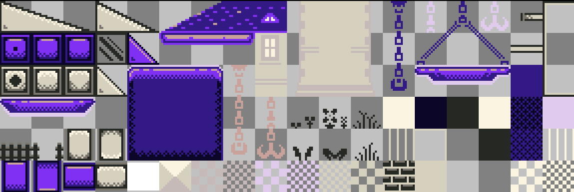

The art itself needed to be simple and clean, able to remain clear when taking on any palette. Ramsey, our character artist, did an incredible job creating designs that shined in just a few shades of a single color. Being limited to one palette was a bit like drawing in black and white: we couldn’t use color representationally or as a foil for other colors, so our only tools were saturation, brightness, and contrast.
We also narrowed down our already limited palettes to maximize clarity – we wanted the player characters to “pop,” so I avoided the brightest colors when drawing environment tiles, leaving those for the characters drawn by Ramsey. The characters also have an extra white outline added in code, creating a “sticker effect” that allows them to stand out even more against the backdrop of chaotic gameplay.
There are lots of great resources for learning to draw pixel art, but I especially like Pedro Medeiros’ series, “How to start making pixel art,”] which includes pixel-specific tips alongside more general color theory that was especially useful to Dyebreaker.
Writing a Simple Color Map Shader
Previewing different palettes in Aseprite was all well and good, but we needed to start remapping sprite colors on the fly, during gameplay. To do that, we needed to write a shader.
Shaders use specialized code to make intricate graphical calculations. Shaders are an intimidating topic. They are powerful tools for achieving complex effects in real-time animation, but even as a software engineer, I find shaders obtuse, overcomplicated, and miraculous. Thankfully, we had a bit of guidance from Jonah Wallerstein, who was kind enough to outline his approach to recoloring character art in Kung Fu Kickball. With his help I was able to write a simple shader for color mapping:
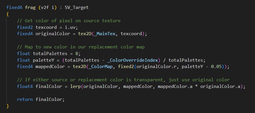
A shader like ours, a “fragment shader,” operates by sampling the color at a given point, working through some logic based on that color (and other inputs), and then spitting out a new color. In other words, it maps one color to another based on predictable rules.
That’s just what we needed – given one base palette on our raw sprite, and given the player’s current team selection, output some other color. But how would the shader “know” which color the dark red, for example, maps to?
It wouldn’t be feasible or performant to do those mappings programmatically, creating a rat’s nest of “if dark red, then…” statements. In shader code, you prefer to avoid conditionals entirely. Instead, we create our color map as a tiny image file, then use a bit of clever geometry to look up the desired color values from that image.
The shader logic goes something like this:
- Sample the color at a given point on the source image.
- Grab the “red” value from the color at that point, i.e. the “R” in “RGBA” color, which is a number from 0 to 255.
- Grab the player’s selected team palette, a number from 0 to 3 (or however many palettes we add).
- Output the color at a specific point on the color map image, namely a point using the 0-255 red value as the X coordinate and the 0-3 palette value as the Y coordinate.
We use the “red value” of the color we want to re-map as a sort of lookup key, which we use to select a “column” from our color map, from 0 to 255 (the image is 255px wide). Our colors have been placed in this map file at the X positions that match the R-value in their color. Once we have identified the target value and looked it up in our map (X position), the player’s palette selection determines how far down the column to move when grabbing a replacement color (Y position).
This is the basic concept of the color map, and we ended up extending this concept across multiple recoloring effects, each with one or more map files to define color relationships. Here’s one such color map at native size:
![]()
And then with a zoomed-in detail:

The gray blocks represent transparency in Aseprite. The four-color columns are colors we want to remap. The topmost pixel in each column is the source color; its R-value corresponds to its X position in this image. That’s the color we’re remapping if we're looking at this column.
Moving down from the top, we see the corresponding values from other palettes – dark purple and dark green under the dark red, for example – that we should map to, given the player’s selections. In this way, we can take an input color and return an appropriately mapped output.
Some Nitty Gritty Caveats
You might have noticed an issue with this approach – if we only use a color’s Red value to look it up in the map, the Red values across our colors must be unique. Only one color can exist at a given X position in the map! Indeed, we had one or two “collisions” over the course of our palette development, colors with the same amount of red, especially at the lighter and darker ends of the spectrum. Thankfully, 255 is a big enough number that shifting the Red value up or down by one did not have a visible effect on the color, and doing so avoided collisions on the map.
It may also be worth noting that this example describes recoloring an individual sprite, but for Dyebreaker, we employed that same logic as a full-screen post-processing effect. In fact, only some assets are recolored directly: the right-hand team’s sprites are recolored from the red to the purple palette. Then, the post-processing handles mapping this “red vs purple” team arrangement into any other possible color combinations. That said, it’s the same shader logic – it’s just that the shader uses a point on the screen for its source color, not a point on a sprite.
A note on neutral colors: you may remember that we didn’t want all colors remapped. To avoid recoloring the neutral palette, we simply avoid adding those colors to the map. If the shader code attempts to look up a replacement color for a neutral value, it will find nothing (pure transparency) at the target position in the map image. Our shader ignores transparent points and returns the original color.<be>
Lastly, the code sample above has been edited. I removed some special cases added to account for other recoloring effects, like full-screen fading that conforms to our palettes. The screenshot also crops out other necessary bits of the shader file; I recommend reading more about writing custom shaders if you’d like to write your own. There’s also Shader Graph.
Using Our Shaders in Unity
We have our sprties and our logic for recoloring them, so the last step is putting it all together in the engine. In Unity, a shader is assigned to a Material, and the Material can be applied to an object to affect its appearance. Our “ColorizeMaterial” holds our shader code and keeps a reference to the image map the shader uses when recoloring:
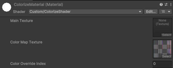
The “Shader” and “Color Map Texture” are filled out with our shader file and color map image. “Main Texture” and “Color Override Index” are blank for now – “Main Texture” is the input texture that will be set automatically by the renderer using this material, and we’ll add some code to populate “Color Override” with an index based on the player’s team selection.
We put that code in a new Unity MonoBehavior, a “Colorizer” component, which we attach to sprites in need of recoloring. The Colorizer component keeps a reference to the sprite renderer, which in turn references our ColorizeMaterial and thus our shader code. It’s a bridge between the shader and the rest of the game.
The component does a handful of things, like fading within palettes or dynamically loading the ColorizeMaterial, but its core functionality a simple assignment of a palette index to the material, so the shader knows which color to map to:

A Colorizer can be assigned a palette (by team, i.e. left team = red) in the Unity inspector, allowing us to create prefabs with specific color palettes, or it can be overridden in code, allowing us to create team-themed objects on the fly:

With this new script, we can easily tell an object which palette it should use, that palette will then be assigned to the shader at runtime, and the shader will recolor our sprites from one palette to another. It works!
Finishing it Out and Dialing it In
I always thought shaders were out of my reach. Breaking this challenge down to its component parts and tackling each one with logic even I could follow, it demystified a mysterious subject and energized me to solve even more complex problems. It also made the game better.
These are my favorite moments in game development: when a creative solution to a technical problem ends up contributing to the overall fun of the game. “Fun” is tough to pin down, and for Dyebreaker, I think a bit of the fun comes from seeing your team colors wash over the stage as you push to victory.
But we wouldn’t have any of that if I hadn’t needed to solve the problem of having playable characters displayed in any color. Once I got that working, I realized we could recolor anything, so why not paint the stage? Dyebreaker’s signature push and pull of color was a side effect of technical problem-solving, and it even led to a modification of the physical cabinet.
We released the Dyebreaker cabinet, called it “done”, but I had one issue: I liked our color swapping so much that I decided it wasn’t being used enough – we had this awesome system for recoloring art, but the players could only see it in action on one screen! The “lobby” was the only place for players to change their team's color.
We decided to get weird with it, and added permanent “Colorize” dials to the cabinet. Players can now cycle through team colors using physical controls – even during gameplay, which really highlights the real-time nature of the recoloring (and opens up new avenues for messing with your opponents).
